A CSS brain teaser
This week, I encountered a nice brain teaser in front end development. After 2 hours of brainstorming, I finally found a solution that pleased me. I posted the problem on Twitter, then on my blog. To my surprise, I had a lot of answers, and some of them were actually pretty ingenious. So I decided to translate it in english so you english folks can enjoy it too.
So here it is :
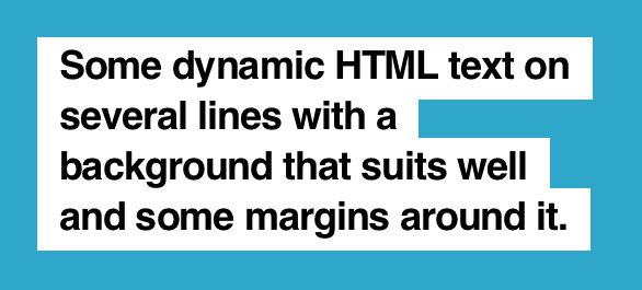
It’s a pretty common visual effect, especially in print magazines. However, I found out that it was not that intuitive to reproduce this effect simply in CSS.
Here are the rules :
- The text must not be divided by any tags (so no span for each lines, no br)
- You can use as many tags as you want around the text
- No JavaScript, only HTML and CSS
- The white background must follow around the text
- There is a margin inside the white background around the text of 20px on the left and right, and about 10px on top and bottom
- The text is dynamic, so we must be able to easily change it and still have the visual effect
- The solution must work on modern browsers (IE9, Firefox 13, Chrome 19, …)
To help you get started, I created a sample code on jsFiddle. You’re free to edit the HTML and CSS, as long as you respect the rules above.
I invite you to share your realisations on the comments below. I’ll publish the solution I came up with later this week. Have fun, and good luck to all !
